Creating an award-winning digital experience for Sealy of Australia
Web
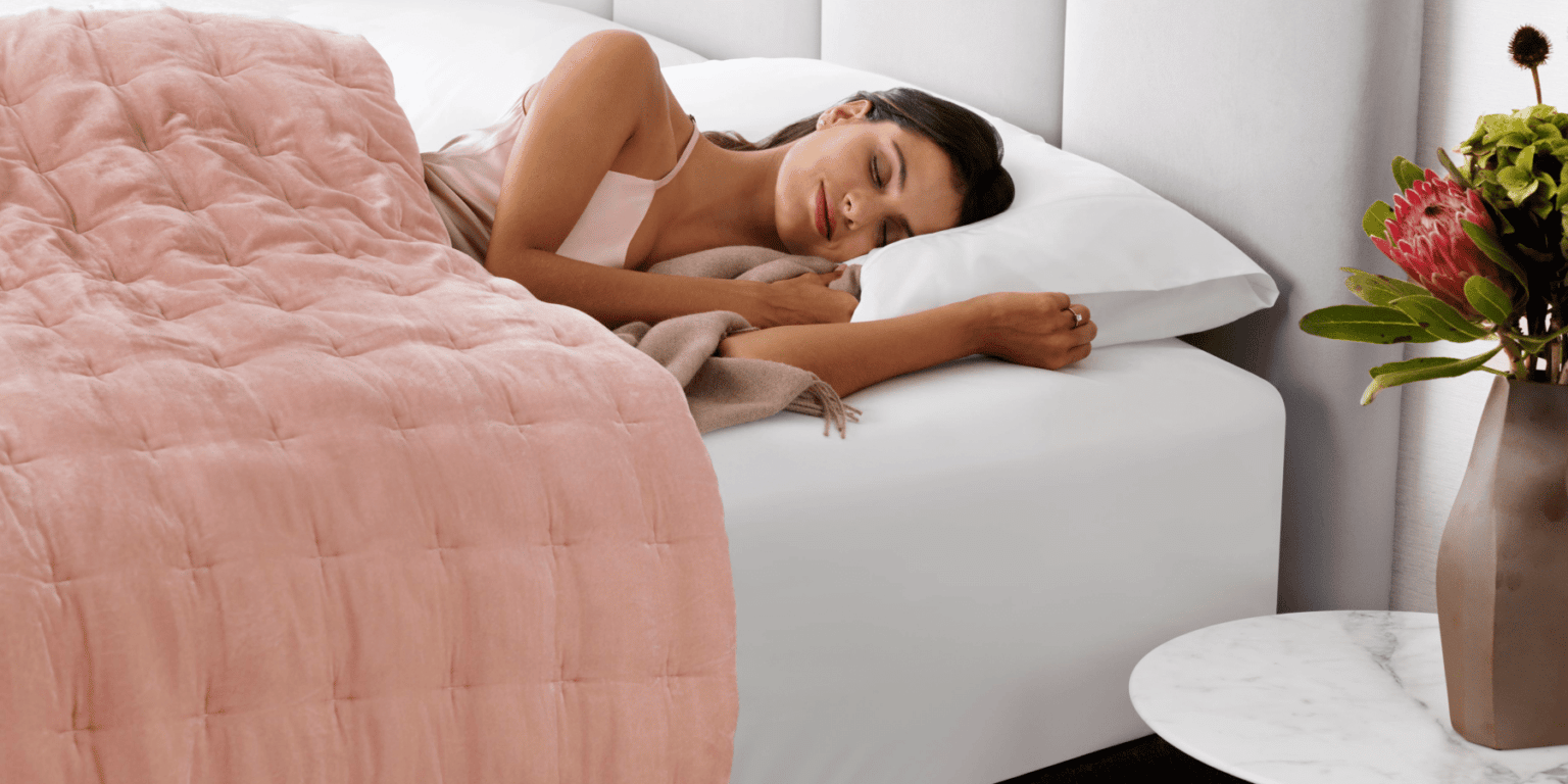
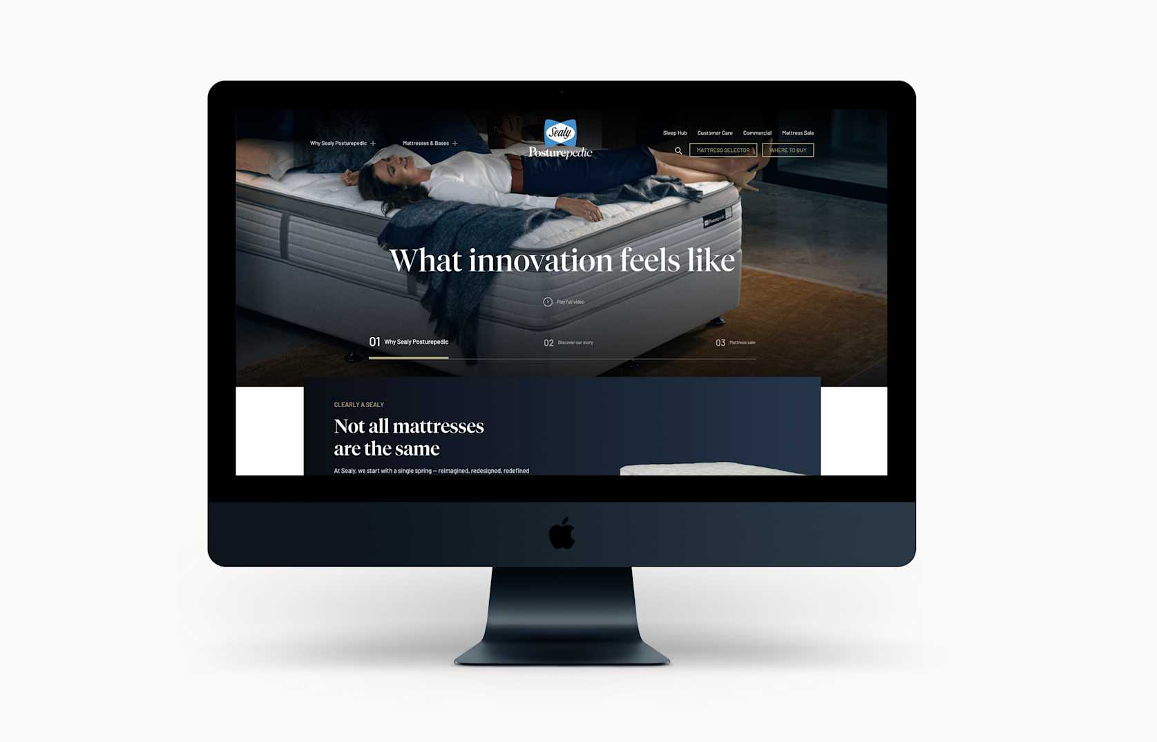
Sealy of Australia conducted an extensive search for a digital agency that shared their vision – to assist in creating a system that first builds brand conviction online, and then simplifies the selection process to ensure users are connected to their most suitable mattress.
The Challenge.
From our research, we found that 85% of consumers start their mattress journey online. This broad insight drove us to then create website user personas to ensure we intimately understand them and design an experience to suit their needs.
The personas were:
Luxury consumer (loyal)
Fence-sitter
Young affluent millennial
Commercial
Post-sale/service
The critical persona identified was the fence-sitter – someone who was aware of the Sealy Posturepedic brand but weren’t able to determine which mattress was appropriate for their needs. This audience, critically, are not entering a physical store with the certainty that other audience groups had – that Sealy Posturepedic was the right brand for them. Therefore, the fence-sitter audience formed the focus of our experience design, to ensure business impact and revenue lift from our solution.
Central to our research was also a comprehensive analysis of the existing website’s performance and understanding user behaviour and the existing pain points. By recognising these points of friction, we were able to overcome them in the revised solution.
Following this, we then conducted user focus groups and one on one surveys to validate the points of friction and understand what users need from the research phase of their mattress purchasing journey.
The Solution.
It became clear from this consultation that matching a user to an appropriate mattress wasn’t the only challenge – but then displaying to the user where they can see that mattress on the showroom floor (live data) would then allow them to continue their purchase journey without friction.
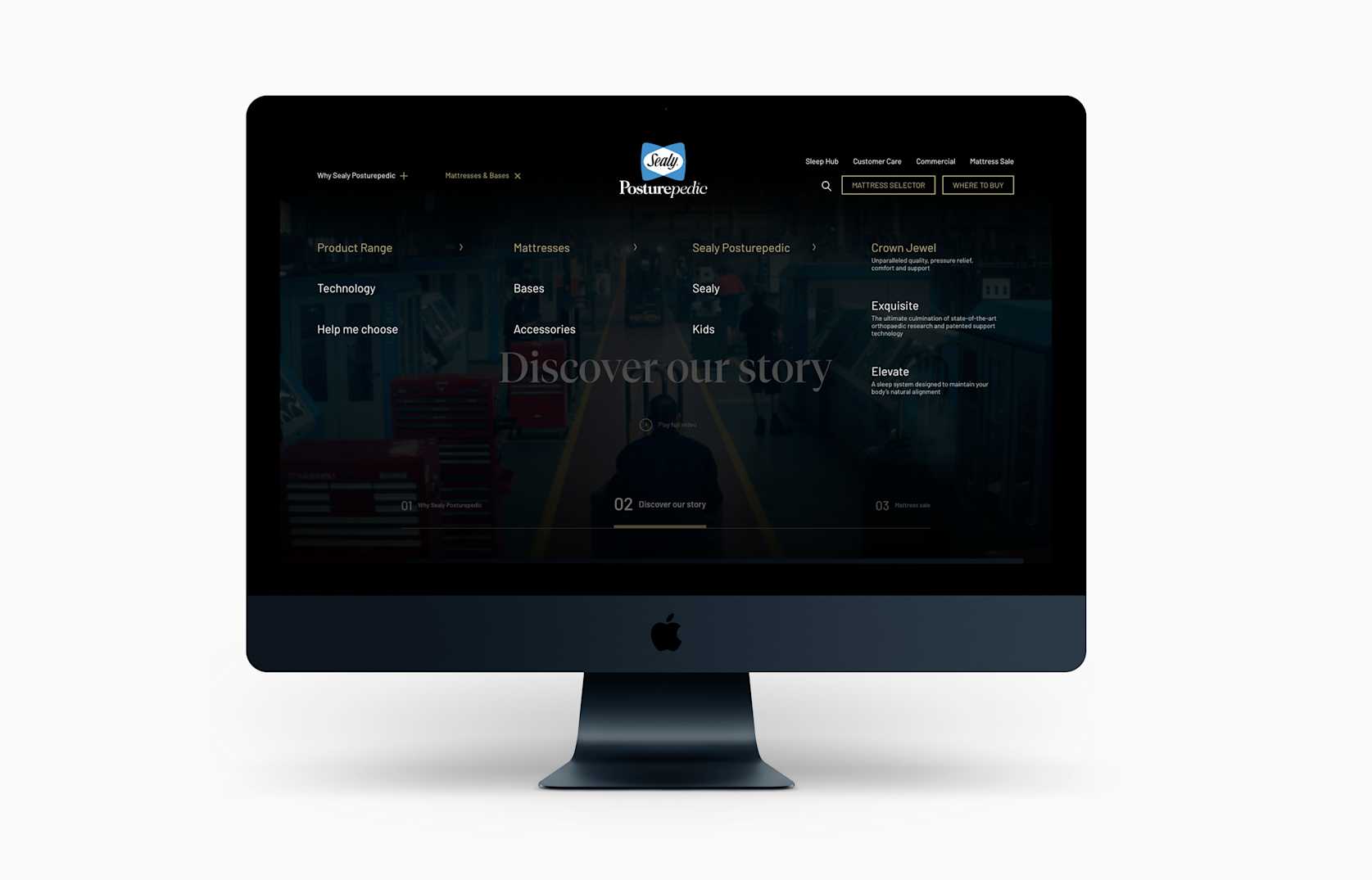
We worked closely with the Sealy of Australia team to create an experience that reduced ‘choice paralysis’ and cognitive overload – and simplifying the product categories. Instead of adhering to the complexities of their detailed catalogue, we recommended simplifying the segments to only three: Elevate, Exquisite and Crown Jewel. In summary, this was a ‘good’, ‘better’, ‘best’ approach to product segmentation.
Central to this was creating a staggered-selection menu, which reduced choice paralysis at each stage of product consideration.
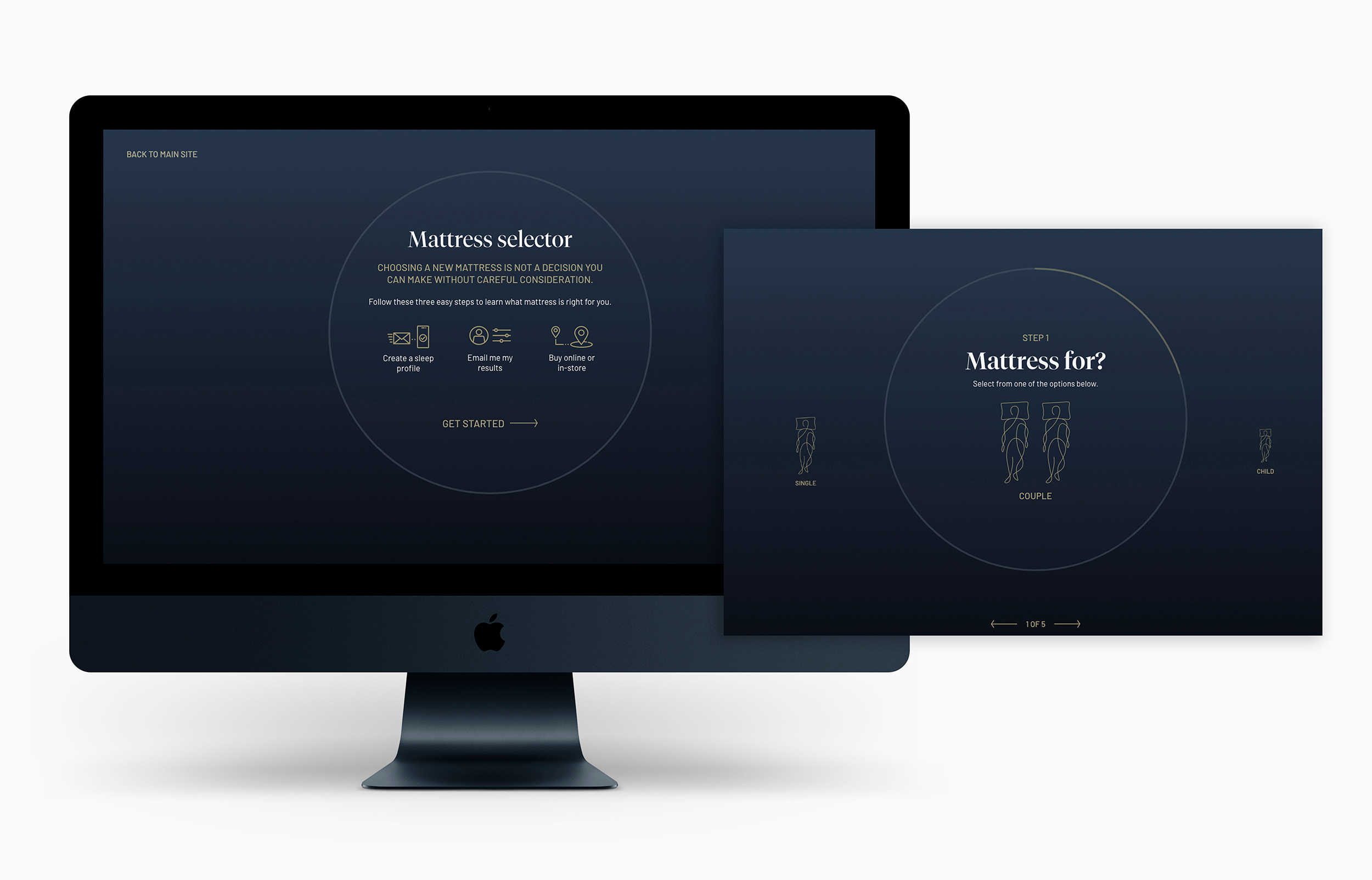
Another central components of our experience design was the Mattress Selector. Overall, we created a detailed journey that was simplified to 5 steps. We also introduced interactive UI elements to prompt better engagement and more intuitiveness through use of the tool.
The interface also becomes immersive, to reduce clutter and cognitive overload when users are utilising the system.
Once the five step journey is complete, the system algorithmically (based on a complex data matrix) suggests a mattress product and provide its rationale beneath. From there, the user has the ability to email themselves the result (data capture) or find which retailers have this product in stock.
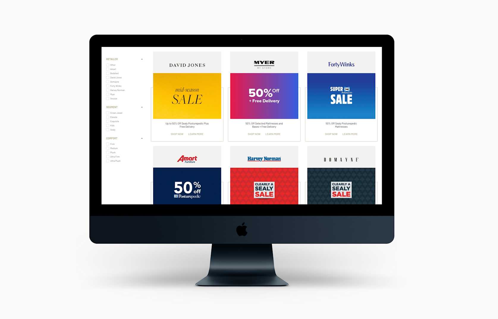
We challenged the client to have their sales team regularly collect and input showroom data from their retailers (e.g. Harvey Norman) into their internal ERP. Our website was then able to fetch this data and present it on the front-end, ultimately allowing users to see which of their closest stockist have that specific mattress in stock and, more importantly, which of them have the mattress available to view on their showroom floor.
In addition to the Mattress Selector and Where to Buy experience enhancements, we also overhauled the product segment pages. Central to a customer’s conversion was their understanding of the Sealy Posturepedic difference. We ensured the product segment pages adequately outlined the technology that leads to a better night’s sleep, and that ultimately not all mattresses are the same.
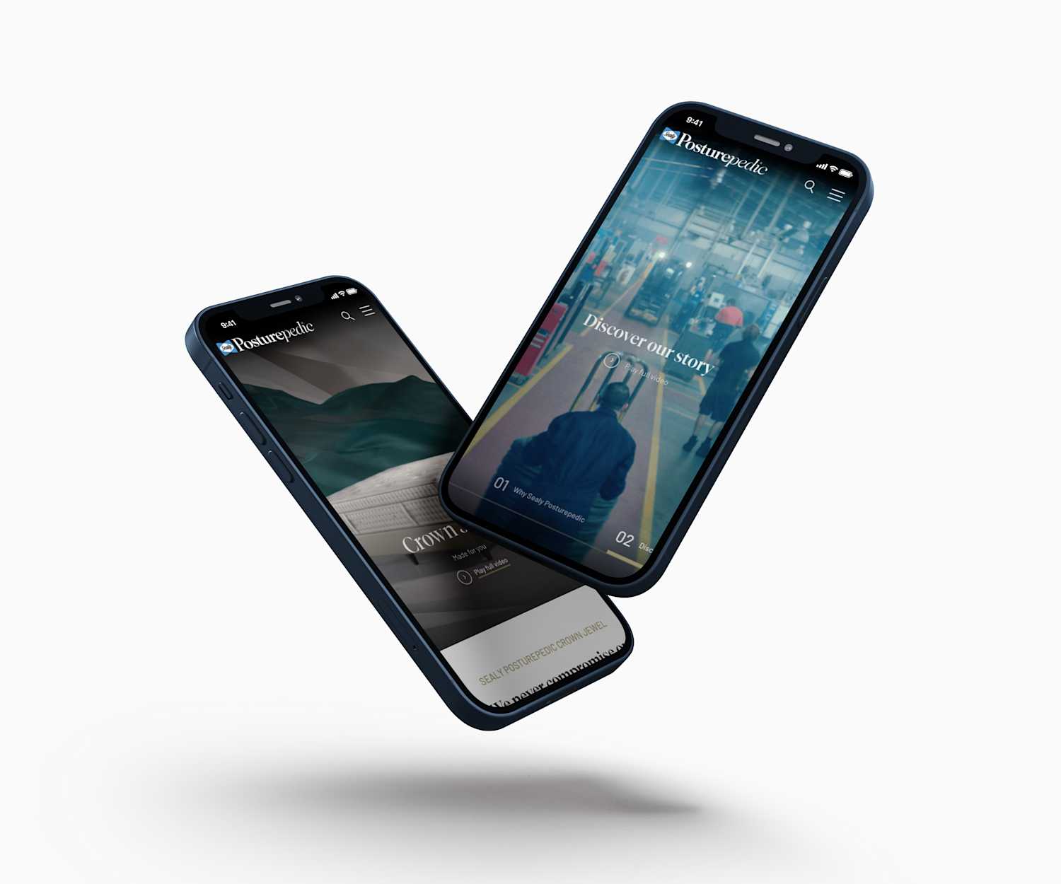
Lastly, it was imperative that the mobile experience was not simply ‘responsive’ but instead ‘adaptive’ – adding and removing elements to better suit a portable device experience. All key journeys have been separately designed and built for the mobile experience to ensure they are not simply an afterthought, and instead showcase a mobile-first experience.
The Results.
We have been closely monitoring user journey recordings and heatmaps since the launch of the new website (October 2021). The revised experience showed immediate results – as show below:
85% mattress selector completions
22% improved exit rate on website
5% increased time on website
Following a post-launch survey, users reported a 28% increase in website effectiveness.
More brands that we’ve helped.


Featured insights from our team.


